The Importance of User Experience in Web Design

In today’s digital world, a website often serves as the first impression of a business or brand. Therefore, the User Experience (UX) is crucial to successful web design. A thoughtfully designed UX can determine whether visitors engage with your site or leave quickly. Let’s explore why UX is essential and how it can influence a website’s performance and user engagement.

What is User Experience?

User Experience refers to the overall interaction users have with a website. It involves various elements such as usability, accessibility, performance, and user satisfaction. A strong UX design ensures users can navigate the site efficiently, find the information they need, and enjoy the experience.

Key Elements of UX
  1. Usability: This aspect focuses on creating an intuitive and easy-to-navigate website. Users should be able to accomplish their goals with minimal effort, reducing frustration and enhancing the overall experience.

  2. Accessibility: Websites should be designed to be accessible to all users, including those with disabilities. This not only expands your audience but also demonstrates a commitment to inclusivity and legal compliance.

  3. Performance: Speed and responsiveness are critical. A website should load quickly and function smoothly to prevent users from becoming impatient and leaving.

  4. Visual Appeal: While UX is more than just aesthetics, an attractive design can capture attention and encourage exploration. Consistent use of colors, fonts, and layouts helps create a cohesive and engaging experience.

  5. Content Quality: Content should be relevant, clear, and valuable. Users should be able to find accurate information easily without sifting through unnecessary clutter.


Why UX Matters?

  • Enhancing User Satisfaction

A focus on UX results in a website that is both pleasant and efficient for users. Satisfied users are more likely to return, becoming repeat visitors and loyal customers.

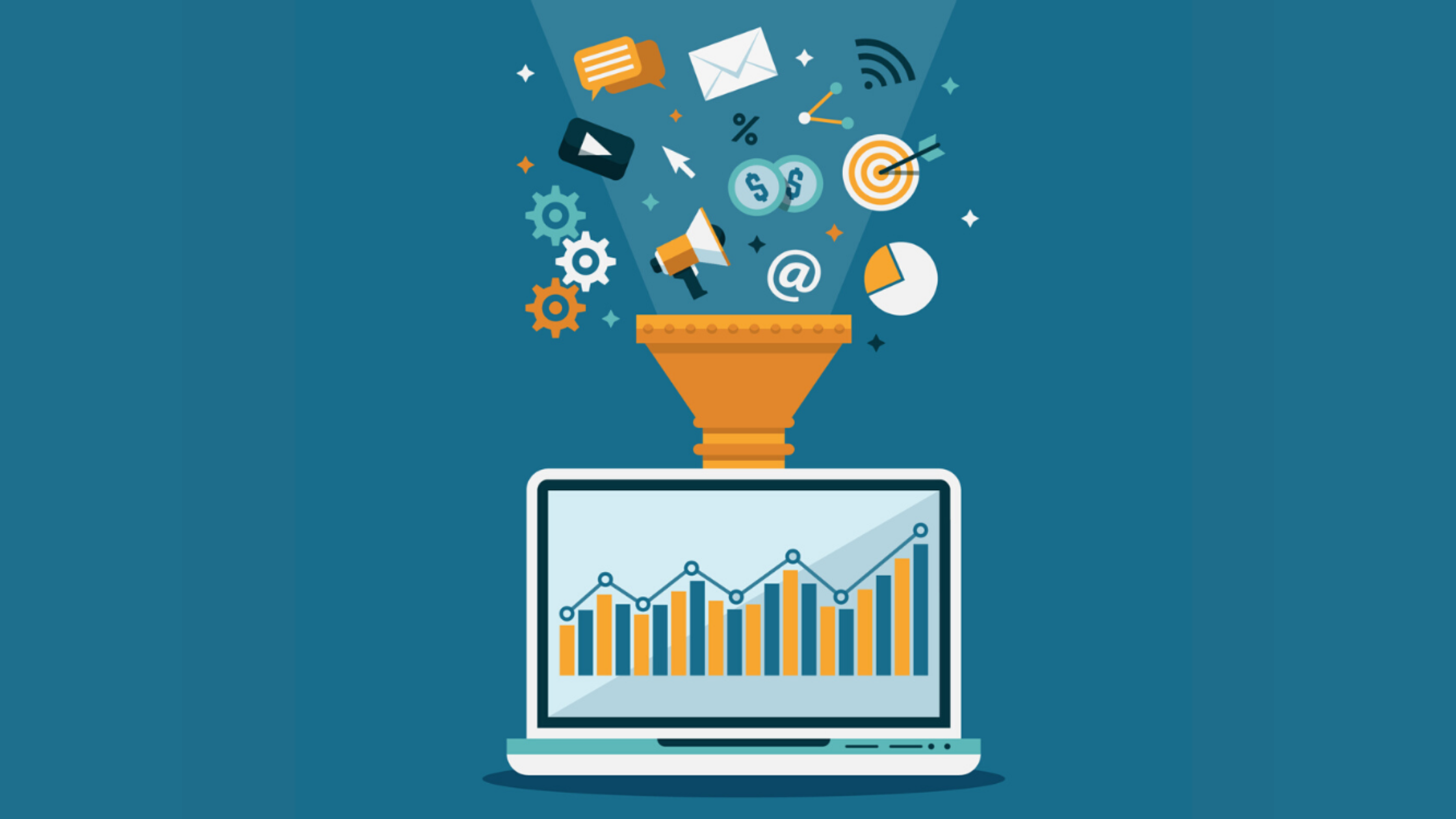
  • Improving Conversion Rates

An intuitive UX can boost conversion rates by guiding users effortlessly through their desired actions, such as making purchases or signing up for newsletters.

  • Reducing Bounce Rates

Poor UX often leads to high bounce rates, as users quickly leave sites that frustrate them. Addressing usability and performance issues keeps users engaged and reduces bounce rates.

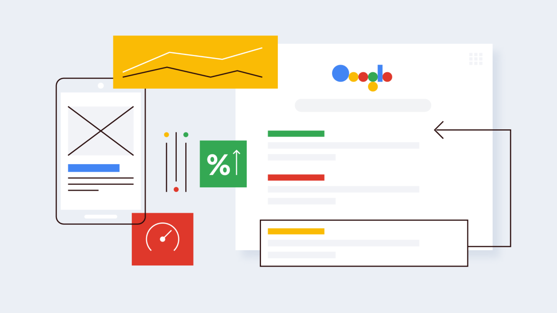
  • Boosting SEO Rankings

Search engines like Google favor websites with excellent UX, resulting in improved search engine rankings and greater visibility.

  • Building Brand Credibility

A seamless user experience builds trust and credibility. Users are more likely to trust a brand that invests in creating a high-quality online presence.

How to Enhance UX in Web Design?

  1. Conduct User Research: Gather insights into your audience’s needs and preferences through surveys, interviews, and analytics to inform your design decisions.

  2. Create User Personas: Develop personas to represent different segments of your audience, tailoring your design and content to meet their specific needs.

  3. Implement Prototyping and Testing: Use prototypes to visualize design concepts, and conduct usability testing to gather feedback and refine your designs.

  4. Focus on Mobile Responsiveness: With the growing use of mobile devices, ensure your website is responsive and provides a great experience across all screen sizes.

  5. Prioritize Simplicity and Clarity: Maintain a clean and straightforward design with a clear hierarchy to guide users through the content without overwhelming them.

Conclusion

User Experience is a cornerstone of effective web design. By prioritizing UX, you create a website that meets user needs and achieves business goals. Investing in UX design enhances user satisfaction, boosts conversion rates, and strengthens brand credibility, ultimately contributing to the long-term success of your website.

Simplifying Modern Web Design with CSS Flex Layouts

In the world of web design, mastering CSS Flex Layouts can be a game-changer. As a front-end developer, knowing how to wield CSS Flexbox effectively can make your projects more flexible, responsive, and visually appealing. In this guide, we’ll explore CSS Flex Layouts in simple terms, uncovering their power and versatility for creating modern web designs with ease.

What are CSS Flex Layouts?

CSS Flex Layouts, also known as Flexbox, are like magic tools for arranging elements on a webpage. They allow you to create flexible and dynamic layouts by distributing space among items and aligning them within a container, all with minimal code.

Why are they awesome?

Flexibility at Your Fingertips: With CSS Flex Layouts, you have the power to control the arrangement, alignment, and sizing of elements with ease. No more wrestling with floats or complicated positioning tricks.

Responsive by Design: Flexbox is inherently responsive, making it effortless to create layouts that adapt beautifully to different screen sizes and devices. Say goodbye to the headache of managing multiple versions of your site for desktop, tablet, and mobile.

Simplified Centering and Alignment: Aligning elements vertically or horizontally has never been simpler. Flexbox provides intuitive ways to center elements and distribute space evenly, saving you time and frustration.

Streamlined Code: With Flexbox, you can achieve complex layouts with far less code than traditional methods, resulting in cleaner, more maintainable stylesheets.

How to Master CSS Flex Layouts:

Get to Know Flex Properties: Familiarize yourself with key Flexbox properties like display: flex, flex-direction, justify-content, and align-items. These properties are your building blocks for creating flexible layouts.

Experiment and Iterate: Don’t be afraid to experiment with different combinations of Flexbox properties to see how they affect layout and alignment. The more you play around, the more confident you’ll become in using Flexbox effectively.

Think in Flex Terms: Start thinking in terms of flex containers and flex items. Visualize your layout as a series of flex containers, each containing one or more flex items that you can manipulate to achieve your desired design.

Combine with Other Techniques: Flexbox plays well with other layout techniques like CSS Grid Layouts. Experiment with combining Flexbox and CSS Grid to leverage the strengths of each approach and create even more sophisticated layouts.

Let’s Make it Simple:

Flexible Navigation Bar: Create a navigation bar that adjusts smoothly to different screen sizes using Flexbox. No more cramped menus on small screens or wasted space on large ones.

Dynamic Card Layout: Design a card-based layout for displaying content such as articles or products. Flexbox makes it easy to arrange cards neatly in rows or columns, with consistent spacing between them.

In Conclusion:

Mastering CSS Flex Layouts is a valuable skill that can empower you to create visually stunning and highly functional websites with confidence. By understanding the basics, experimenting with different layouts, and incorporating Flexbox into your workflow, you’ll be well on your way to simplifying modern web design and delighting users with flexible, responsive layouts. So go ahead, dive in, and unlock the full potential of CSS Flexbox for your next project!

Responsibilities and Roles of Front-End Developers

Front-end developers are instrumental in creating the visual and interactive elements of websites and web applications, shaping the user interface (UI) and optimizing the user experience (UX). Their roles and responsibilities span a wide range of tasks, combining technical expertise with design sensibilities. In this detailed exploration, we’ll delve into the multifaceted responsibilities and roles of front-end developers.

1. HTML, CSS, and JavaScript Proficiency:
Front-end developers are experts in HTML, CSS, and JavaScript—the foundational technologies of web development. HTML structures the content, CSS styles the layout, and JavaScript adds interactivity and dynamic behavior to the user interface.

2. Responsive Design Implementation:
Ensuring a seamless experience across various devices is a primary responsibility. Front-end developers implement responsive design principles, utilizing flexible layouts and media queries to ensure websites and applications adapt fluidly to different screen sizes.

3. JavaScript Frameworks and Libraries:
Modern front-end development often involves the use of JavaScript frameworks and libraries. Frameworks like React, Angular, and Vue.js streamline development, enabling the creation of interactive and scalable user interfaces. Front-end developers leverage these tools to build efficient and maintainable code.

4. UI/UX Design Collaboration:
Collaboration with UX/UI designers is crucial. Front-end developers work closely with designers to translate visual concepts into functional code. This collaboration involves understanding design requirements, providing technical insights, and ensuring that the final user interface aligns with the intended user experience.

5. Cross-Browser Compatibility Testing:
Front-end developers must ensure that web applications work consistently across different web browsers. Rigorous testing is conducted to identify and address any compatibility issues, ensuring a consistent and reliable experience for users using diverse browsers.

6. Performance Optimization:
Optimizing the performance of web applications is a continuous focus. Front-end developers employ techniques such as code splitting, lazy loading, and minimizing resource requests to enhance page loading times and overall user experience.

7. Version Control (Git):
Version control is essential for collaborative development. Front-end developers use tools like Git to manage code changes, collaborate effectively with team members, and maintain a versioned codebase for better project organization.

8. Testing and Debugging:
Thorough testing is a crucial aspect of front-end development. Front-end developers conduct unit tests, integration tests, and user acceptance tests to identify and fix bugs, ensuring the reliability and functionality of the web application.

9. Collaboration with Back-End Developers:
Effective collaboration with back-end developers is essential for seamless integration. Front-end and back-end developers work together to ensure that the user interface aligns seamlessly with the functionality provided by the server-side logic.

10. User Interface Development:
Front-end developers are responsible for designing and implementing the visual elements of websites and applications. This involves creating layouts, navigation structures, and UI components to deliver an aesthetically pleasing and user-friendly interface.

11. Continuous Learning and Adaptation:
The field of front-end development evolves rapidly. Front-end developers engage in continuous learning to stay updated on emerging technologies, tools, and best practices, ensuring they can apply the latest industry trends to their projects.

12. Documentation:
Creating and maintaining documentation is a best practice. Documentation serves as a reference for the development team, aiding in knowledge transfer, onboarding new team members, and ensuring clarity regarding code structures and project processes.

13. Communication Skills:
Effective communication is paramount. Front-end developers need to articulate their ideas, collaborate with team members, and provide updates on project progress. Strong communication skills contribute to successful teamwork and project outcomes.

In conclusion, front-end developers play a pivotal role in delivering visually appealing, responsive, and user-friendly web applications. Their diverse skill set, from coding proficiency to design collaboration, ensures the creation of compelling digital interfaces. As technology continues to evolve, front-end developers remain at the forefront, driving innovation and enhancing the overall user experience on the web.

– Harish Shimpi.

The Benefits of Hiring Laravel Web Development Services

Hiring Laravel Web Development services can offer several benefits for your web development projects. Laravel is a popular open-source PHP framework that provides tools and features to streamline the development process, enhance code quality, and create robust web applications.

Here are some of the benefits of hiring Laravel web development services:

  1. Rapid Development: Laravel comes with a variety of built-in tools and libraries that speed up the development process. This allows developers to create web applications more quickly compared to starting from scratch.


  2. Modular Architecture: Laravel follows the MVC (Model-View-Controller) architecture, which promotes a separation of concerns and modularity. This makes the codebase more organized, maintainable, and scalable.


  3. Eloquent ORM: Laravel’s Eloquent ORM (Object-Relational Mapping) simplifies database operations by providing an intuitive and expressive way to interact with databases. This reduces the amount of manual SQL coding and improves code readability.


  4. Security: Laravel incorporates security features like hashed passwords, protection against SQL injection, and cross-site scripting (XSS) attacks. It also provides built-in tools for handling authentication and authorization.


  5. Community and Documentation: Laravel has a vibrant and active community of developers who contribute to its growth. This results in regular updates, bug fixes, and a wealth of documentation and tutorials available online.


  6. Testing Support: Laravel includes a testing suite for writing unit and integration tests. This promotes the development of robust, bug-free applications by allowing developers to catch issues early in the development process.


  7. RESTful Routing: Laravel makes it easy to define clean and understandable RESTful routes, which are crucial for creating APIs and maintaining a consistent URL structure.


  8. Caching and Performance: Laravel provides caching mechanisms that can significantly improve the performance of your applications. Features like built-in support for popular caching systems and a query caching system help in optimizing database queries.


  9. Blade Templating Engine: Laravel’s Blade templating engine simplifies the process of creating dynamic views and layouts. It supports features like template inheritance and control structures, making it easier to manage complex UIs.


  10. Third-party Integration: Laravel allows easy integration with third-party services and packages through Composer, a dependency management tool for PHP. This means you can leverage existing solutions to add functionality to your application without reinventing the wheel.


  11. Active Record Implementation: Laravel’s Active Record implementation, provided by Eloquent, simplifies database interactions and allows developers to work with database records as objects, making the code more intuitive and expressive.


  12. Scalability: With proper architecture and coding practices, Laravel applications can be designed to scale effectively as your user base grows.

In summary, hiring Laravel web development services can provide you with a solid foundation for creating feature-rich, secure, and maintainable web applications. However, it’s important to choose experienced and skilled developers who are well-versed in Laravel to fully leverage these benefits.

Kindly click here for more insights.

To hire Laravel developers visit: https://www.nullplex.com/contact-us

Unleash The Power Of Digital Marketing

The power of digital marketing lies in its ability to reach a wide audience, engage with them in a personalized manner, and measure the impact of marketing efforts more accurately compared to traditional marketing methods. Nullplex provides feasible digital marketing services.

Here are some key aspects that highlight the power of digital marketing:

1. Global Reach: 
Digital marketing allows businesses to transcend geographical boundaries and target audiences around the world. With internet penetration and mobile device usage increasing globally, businesses can reach potential customers anywhere, anytime.

2. Targeted Audience: 
One of the significant advantages of digital marketing is the ability to target specific audiences based on various parameters such as demographics, interests, behavior, and preferences. This targeted approach helps businesses deliver personalized messages and offers, increasing the chances of conversion.

3. Cost-Effectiveness: 
Digital marketing often offers a more cost-effective alternative to traditional marketing channels like TV, print, or radio. Online advertising platforms enable businesses to set flexible budgets, reach their desired audience, and optimize campaigns based on real-time data. This allows for better control over spending and higher return on investment (ROI).

4. Measurable Results: 
Digital marketing provides robust analytics and tracking tools that enable businesses to measure the effectiveness of their campaigns accurately. Key performance indicators (KPIs) such as website traffic, conversions, click-through rates, and engagement can be tracked and analyzed. This data helps businesses make data-driven decisions and optimize their marketing strategies for better results.

5. Enhanced Engagement: 
Digital marketing enables two-way communication between businesses and their target audience. Through social media, email marketing, interactive content, and chatbots, businesses can engage with customers, address their queries, and build stronger relationships. This engagement fosters brand loyalty and encourages customer advocacy.

6. Flexibility and Adaptability: 
Digital marketing allows for quick adjustments and modifications to campaigns based on real-time data and market trends. It offers the flexibility to experiment with different strategies, platforms, and content formats to optimize results. Businesses can adapt their marketing efforts to suit changing consumer behaviors and preferences.

7. Integration and Automation: 
Digital marketing can be seamlessly integrated with other business systems and tools, such as customer relationship management (CRM) software, content management systems (CMS), and marketing automation platforms. This integration streamlines processes, automates repetitive tasks, and improves overall efficiency.

8. Data-Driven Insights: 
The digital landscape generates vast amounts of data, which can be harnessed to gain valuable insights into consumer behavior, preferences, and market trends. Businesses can leverage data analytics tools to uncover patterns, identify opportunities, and make informed decisions to enhance their marketing strategies.

Overall, digital marketing empowers businesses with the ability to connect with their target audience on a deeper level, increase brand awareness, drive conversions, and achieve business goals in a measurable and cost-effective manner.

Nullplex use a variety of digital marketing tools and techniques to reach your target audience, increase brand awareness, and drive more traffic to your website.

Retail Business That Gets Boosted By Mobile Commerce

The retail industry has undergone a significant transformation in recent years due to the rise of mobile commerce apps. With more and more consumers using smartphones and tablets to shop online, retailers are recognizing the importance of creating a mobile commerce strategy to stay relevant and competitive in today’s digital age. In this blog, we will explore how mobile commerce apps can boost retail business and improve the overall shopping experience for customers.

  • Increased Sales

Mobile commerce apps provide customers with a convenient and seamless shopping experience they can access from anywhere. With a mobile app, customers can browse products, make purchases, and track their orders from their hands. This convenience can lead to higher sales for retailers as customers are more likely to make purchases when they can easily access products and services.

  • Improved Customer Engagement

Mobile commerce apps also improve customer engagement by providing a personalized and interactive shopping experience. Retailers can use customer data to personalize recommendations and offer to each customer, making their shopping experience more enjoyable and relevant.

  • Enhanced Brand Loyalty

By providing customers with a convenient and personalized shopping experience, retailers can build stronger relationships with their customers. Mobile apps can also include loyalty programs that reward customers for their repeat business and encourage them to return for future purchases.

  • Increased Efficiency

With features such as inventory management, order tracking, and payment processing, retailers can streamline their operations and reduce the time and resources needed to manage their business. This increased efficiency can lead to cost savings for retailers and a better overall shopping experience for customers.

  • Improved Analytics

Finally, mobile commerce apps provide retailers with valuable data and analytics that can be used to improve their business. By tracking customer behaviour, preferences, and purchasing patterns, retailers can gain insights into their customers’ needs and preferences. This information can then be used to make better-informed decisions about product offerings, pricing, and marketing strategies.

In conclusion, mobile commerce apps have the potential to revolutionize the retail industry by providing customers with a convenient, personalized, and seamless shopping experience. By investing in a mobile commerce strategy, retailers can boost sales, improve customer engagement, increase brand loyalty, increase efficiency, and gain valuable data and analytics. As mobile technology continues to evolve, retailers must continue to adapt and innovate to stay ahead of the competition and meet the changing needs of their customers.

How Do I Get My Website to Rank on Google?

If you have a website, you likely want it to appear on the first page of Google search results. After all, the higher your website ranks, the more likely it is that people will find and click on it. But with so many websites out there, how do you make sure yours stands out? Here are some tips to help you improve your website’s ranking on Google. 

  1. Develop a website: 
    Hire a trusted digital agency dealing in website development. Make sure that your website should be visible on all mobile and desktops. Check out how to design responsive a website.


  2. Research relevant keywords 
    Before you start optimizing your website for search engines, you need to figure out what keywords people are using to search for your content. Use tools like Google Keyword Planner, SEMrush, or Ahrefs to find relevant keywords and phrases that you can use throughout your website.


  3. Optimize your website for those keywords 
    Once you have a list of relevant keywords, it’s time to optimize your website for them. Check it out on our SEO page. Make sure that your website content, including headlines, meta descriptions, and image alt tags, includes these keywords. But be careful not to overdo it – Google penalizes websites that use too many keywords.


  4. Publish high-quality content
    One of the most important factors in ranking on Google is the quality of your website content. Make sure that you’re publishing high-quality, relevant content on a regular basis. This will not only keep your visitors engaged but also signal to Google that your website is an authoritative source of information.


  5. Get backlinks
    Backlinks are links from other websites that point to your website. The more high-quality backlinks you have, the more likely it is that Google will consider your website to be an authority in your niche. Reach out to other website owners and ask if they would be willing to link to your website.


  6. Use social media to promote your website
    Social media can be a powerful tool for driving traffic to your website. Share your content on social media platforms like Facebook, Twitter, and LinkedIn. This will not only help you reach a wider audience but also signal to Google that your website is popular and relevant. Check out here how you can do Social Media Marketing


  7. Improve your website’s speed
    Google takes website speed into account when ranking websites. Make sure that your website loads quickly by optimizing images, minimizing code, and using a fast web host.


  8. Use Google My Business
    Google My Business is a free tool that allows you to manage your business information across Google, including in search results and Google Maps. Make sure that your business information is up to date and that you’re using relevant keywords in your description. 


By following these tips, you can improve your website’s ranking on Google and increase your visibility to potential visitors. Keep in mind that SEO is an ongoing process, so it’s important to continue monitoring and optimizing your website over time. 

Importance of Having A Website For A Startup Business

  1. Online Presence:
    In today’s digital age, having an online presence is vital for any business. A website allows you to have a 24/7 online presence and reach out to potential customers from different parts of the world. Even if your start-up business is small, having a website gives you a professional image that can attract customers and investors.


  2. Increased Credibility:
    A professional-looking website can increase your credibility as a start-up business. Potential customers are likely to trust a business that has a well-designed website with relevant information. A website can also help you showcase your products or services, customer testimonials, and your mission and vision.


  3. Marketing:
    A website is a great marketing tool for a start-up business. You can use your website to promote your products or services and reach out to potential customers. Additionally, you can integrate your website with social media platforms to increase your online presence.


  4. Customer Support:
    A website can also serve as a platform for customer support. You can include a contact form or chatbot on your website to address customer inquiries and concerns. This can help you build a loyal customer base and improve your customer service.


  5. Analytics:
    A website allows you to track user behavior and analyze the effectiveness of your marketing campaigns. With tools like Google Analytics, you can monitor your website traffic, see which pages are popular, and track conversion rates. This information can help you make data-driven decisions to improve your website and marketing strategies. 


In conclusion, having a website for your start-up business is essential. It can help you reach out to potential customers, increase your credibility, and promote your products or services. A website is also cost-effective and can serve as a platform for customer support and marketing. Don’t let your start-up business fall behind the competition, build a website today.

7 Elements That Influence Conversions in Education Web Design 

  1. Clear value proposition
    The value proposition of an education website should be clear and compelling. Visitors should be able to quickly understand what sets the institution apart from its competitors. Use concise and persuasive language to communicate your value proposition, such as “Get the hands-on experience you need to succeed in your career.”


  2. Relevant images and videos
    Images and videos are powerful tools for showcasing an educational institution’s offerings. Use high-quality images and videos that accurately represent the institution and its programs. Include images of campus life, classrooms, and faculty members, as well as videos that provide an inside look at programs and experiences.


  3. Calls to action
    Calls to action (CTAs) are buttons or links that encourage visitors to take a specific action, such as “Apply Now” or “Schedule a Visit”. Use clear and prominent CTAs throughout the website, making it easy for visitors to take the next step in the enrollment process.


  4. Social proof
    Social proof is the idea that people are influenced by the opinions and actions of others. Use testimonials from current and former students, faculty members, and alumni to demonstrate the value of the institution. Additionally, include social media feeds to showcase the institution’s engagement and community.


Transform Your Designs with Condition-Based Styling

Web design is evolving at an incredible pace, and as designers, we find ourselves on the brink of exciting new possibilities. One of the most thrilling advancements is condition-based styling in CSS. Imagine this: your website isn’t just a static page; it’s dynamic, responsive, and interactive. It adapts to different devices, reacts to user actions, and even changes its appearance based on its content. Sounds like magic, right? But it’s very real, and it’s happening right now.

Let’s explore some fantastic ways condition-based styling can elevate your designs. These aren’t just technical tricks—they’re tools that can make your work smarter, your designs more intuitive, and your users much happier.

  1. Adaptive Layouts with Media Queries

Have you ever been frustrated when a beautiful design just doesn’t translate well on smaller screens? Media queries are your best friend in these situations. They allow your layout to flex and flow, no matter what device it’s on. Think of them as your website’s way of understanding its environment. On small screens? Collapse that sidebar into a tidy dropdown. On larger screens? Let your design breathe with bigger fonts and spacious grids. It’s all about meeting users where they are and making them feel comfortable, no matter the device they’re using.

  1. Conditional Styling with :has()

This one is a total game-changer—it’s like giving CSS the ability to “see” what’s inside an element and respond accordingly. Imagine a form that knows when something’s missing or incorrect and changes its style instantly to guide the user. With the :has() selector, you don’t need extra JavaScript or complicated hacks. Your CSS becomes smart, reactive, and elegant. It’s like having a design assistant that’s always a step ahead, taking care of the details so you can focus on the bigger picture.

  1. Cleaner Code with :is() and :where()

Let’s be honest: no one enjoys writing repetitive code. It’s tedious, messy, and a waste of time. That’s where :is() and :where() come in to save the day. These selectors are like group hugs for your styles—you can bundle multiple selectors into one, keeping your CSS clean and manageable. And the best part? :where() maintains low specificity, so it won’t interfere with your other styles. It’s like decluttering your workspace—everything just feels easier and more organized.

  1. Future-Proof Designs with @supports

Let’s face it: dealing with older browsers can feel like wrestling with ghosts of the past. But with @supports, you can create designs that look ahead without leaving anyone behind. Think of it as asking the browser, “Hey, do you know this trick?” before showing off your fancy CSS. If the answer is yes, great—your advanced styles shine. If not, no worries—you’ve got a fallback plan. It’s like being prepared for every scenario, and who doesn’t love that peace of mind?

Why This Matters?

Condition-based styling isn’t just about writing code; it’s about the people using your website. It’s about crafting designs that feel intuitive, adaptable, and, dare I say, magical. When your design reacts to its surroundings and user needs, it feels alive. And that’s what we’re all striving for, right? Websites that aren’t just functional but truly engaging.

Conclusion

The tools are here, waiting for you to experiment and explore. Whether it’s a small tweak with :is() or a dramatic shift using :has(), these techniques can make your designs smarter, more flexible, and more human. So why not take the leap? Play around, try new things, and see how condition-based styling can completely change the way you approach web design. Who knows? You might just fall in love with CSS all over again.

Career Hire Us
Request Callback

Got An Idea?

Let’s Build It.

Tell us what you need, and our team will guide you from concept to launch with clarity, speed, and expert care.